
How to Add Dark Themes in Vue Apps With CSS Variables
- BLACK DEVIL
- Oct 21, 2023
- 4 min read

Implementing dark themes in our web applications has gone from a luxury to a necessity. Device users now want to switch from light themes to dark themes and vice versa due to both aesthetic preferences and practical reasons.
Dark themes offer a darker color palette for user interfaces, making the interface easy on the eyes in low-light environments. Dark themes also help conserve battery life on devices with OLED or AMOLED screens.
Setting Up the Test Application
To get a better understanding of how to add dark themes in Vue, you will need to create a simple Vue app to test-run your development.
To initialize the new Vue app, run the following command from your terminal:
"npm init vue@latest"
This command will install the latest version of the create-vue package, the package for initializing new Vue apps. It will also ask you to choose from a particular set of features. You do not need to select And as it is not necessary for the scope of this tutorial.
Add the following template to the APP.VUE file in your application's src directory:
<!-- App.vue -->
<template>
<div>
<h1class="header">Welcome to My Vue App</h1>
<p>This is a simple Vue app with some text and styles.</p>
<divclass="styled-box">
<pclass="styled-text">Styled Text</p>
</div>
<buttonclass="toggle-button">Toggle Dark Mode</button>
</div>
</template>
Styling the Test Application With CSS Variables
CSS variables, or CSS custom properties, are dynamic values you can define in your style sheets. CSS variables provide excellent tooling for theming because they allow you to define and manage values such as colors and font sizes in one place.
You will use CSS variables and CSS pseudo-class selectors to add a regular and a dark mode theme for your Vue application. In the src/assets directory, create a styles.css file.
Add the following styles to this styles.css file:
/* styles.css */
:root {
--background-color: #ffffff; /* White */
--text-color: #333333; /* Dark Gray */
--box-background: #007bff; /* Royal Blue */
--box-text-color: #ffffff; /* White */
--toggle-button: #007bff; /* Royal Blue */
}
[data-theme='true'] {
--background-color: #333333; /* Dark Gray */
--text-color: #ffffff; /* White */
--box-background: #000000; /* Black */
--box-text-color: #ffffff; /* White */
--toggle-button: #000000; /* Black */
}
These declarations contain a special pseudo-class selector (:root) and an attribute selector ([data-theme='true']). The styles you include in a root selector target the highest parent element. It acts as the default styling for the web page.
The data-theme selector targets HTML elements with that attribute set to true. In this attribute selector, you can then define styles for the dark mode theme, to override the default light theme.
These declarations both define CSS variables using the -- prefix. They store color values which you can then use to style the application for light and dark themes.
Edit the src/main.js file and import the styles.css file:
// main.js
import './assets/styles.css'
import { createApp } from 'vue'
import App from './App.vue'

createApp(App).mount('#app')
Now add some more styles in styles.css, below the data-theme selector. Some of these definitions will reference the color variables using the var keyword. This lets you change the colors in use simply by switching the value of each variable, as the initial styles do.
* {
    background-color: var(--background-color);
    text-align: center;
    color: var(--text-color);
    padding: 20px;
    font-family: Arial, sans-serif;
    transition: background-color 0.3s, color 0.3s;
}

.header {
    font-size: 24px;
    margin-bottom: 20px;
}

.styled-box {
    background-color: var(--box-background);
    color: var(--box-text-color);
    padding: 10px;
    border-radius: 5px;
    margin: 20px 0;
}

.styled-text {
    font-size: 18px;
    font-weight: bold;
}

.toggle-button {
    background-color: var(--toggle-button);
    color: #fff;
    border: none;
    border-radius: 3px;
    cursor: pointer;
    padding: 5px 10px;
}
You can set a transition property on all elements using the universal CSS selector (*) to create a smooth animation when switching modes:
* {
  /* Add more transitions as needed */
  transition: background-color 0.3s, color 0.3s;
}
These transitions create a gradual change in background color and text color when dark mode is toggled, giving a pleasing effect.
Implementing the Dark Mode Logic
To implement the dark theme mode, you will need JavaScript logic to switch between light and dark themes. In your App.vue file, paste the following script block below the template block written in Vue’s Composition API :
<!-- App.vue -->
<scriptsetup>
import { ref } from 'vue';
// Function to get the initial dark mode preference from local storage
const getInitialDarkMode = () => {
const userPreference = localStorage.getItem('darkMode');
return userPreference === 'true' ? true : false;
};
// Define the ref for darkMode and initialize it with the user preference
// or false
const darkMode = ref(getInitialDarkMode());
// Function to save the dark mode preference to local storage
const saveDarkModePreference = (isDarkMode) => {
localStorage.setItem('darkMode', isDarkMode);
};
// Function to toggle dark mode and update the local storage preference
const toggleDarkMode = () => {
darkMode.value = !darkMode.value;
saveDarkModePreference(darkMode.value);
};
</script>
The script above includes all JavaScript logic for switching between the light and dark modes in your web app. The script begins with an import statement to import the ref function for handling reactive data (dynamic data) in Vue.
Next, it defines a getInitialDarkMode function which retrieves the user’s dark mode preference from the browser’s LocalStorage. It declares the darkMode ref, initializing it with the user’s preference retrieved by the getInitialDarkMode function.
The saveDarkModePreference function updates the user’s dark mode preference in the browser’s LocalStorage with the setItem method. Finally, the toggleDarkMode function will let users toggle the dark mode and update the browser’s LocalStorage value for the dark mode.
Applying the Dark Mode Theme and Testing the Application
Now, in the template block of your App.vue file, add the data-theme attribute selector to the root element to conditional apply the dark mode theme based on your logic:
<!-- App.vue -->
<template>
  <!-- added the data theme attribute selector to apply the dark theme
       conditionally -->
  <div :data-theme="darkMode">
    <h1 class="header">Welcome to My Vue App</h1>
    <p>This is a simple Vue app with some text and styles.</p>

    <div class="styled-box">
      <p class="styled-text">Styled Text</p>
    </div>

    <!--added the dark mode switch button-->
    <button @click="toggleDarkMode" class="toggle-button">
      Toggle Dark Mode
    </button>
  </div>
</template>
Here, you’re binding the data-theme selector to the darkMode ref. This ensures that when darkMode is true, the dark theme will take effect. The click event listener on the button toggles between light and dark modes.
Run the following command in your terminal to preview the application:
npm run dev
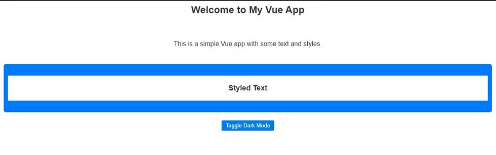
You should see a screen like this:
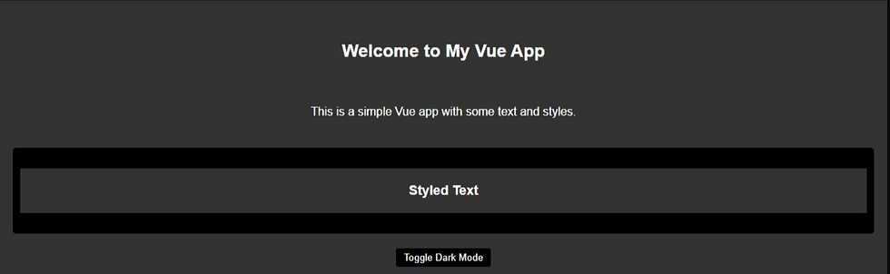
When you click the button, the app should toggle between light and dark themes:


make sure you like share and subscribe :)